Themes and appearance
Sevak follows your system's light or dark mode by default. Everything else is optional and lives in the [appearance] table of config.toml (the Settings window, Appearance page, edits the same values). Settings → Appearance → Theme editor builds complete themes visually, with eight built-in themes and an optional online gallery.
Settings
[appearance]
theme = "system"       # "system", "light" or "dark"
accent = ""            # "#rgb", "#rrggbb", "rgb(r, g, b)" or ""; "" uses the theme's accent
font_size = 15         # 12–22 pixels; the size of result titles
font_family = ""       # "Fira Sans, sans-serif"; "" uses the system font
opacity = 100          # 30–100, percent opacity of the search bar's background
radius = 14            # 0–32, corner radius in pixels
theme_file = ""        # "themes/Nord.toml", a theme file in the config folder; "" uses none
custom_css = ""        # a stylesheet in the config folder; "" loads none
Changes apply when you save in Settings, or after "Reload index" in the tray menu when you edit the file by hand.
There are four layers, each overriding the one before: the built-in light or dark look, a theme file (theme_file), the settings above, and your custom stylesheet.
Configuration through Settings
All these options are available in Settings → Appearance. The GUI guides you with hints for each setting.
Validation
Every value is checked when it is applied. A value that is not valid is ignored (that one setting falls back to its default), a warning is written to the log and shown under Settings → Appearance:
| Setting | Valid range | Default |
|---|---|---|
theme |
"system", "light" or "dark" |
"system" |
accent |
#rgb, #rrggbb, rgb(r, g, b) or empty |
empty (the theme's accent) |
font_size |
whole number 12–22 | 15 |
font_family |
names made of letters, digits, spaces and - _ ., separated by commas; up to 200 characters |
empty (system font) |
opacity |
whole number 30–100 | 100 |
radius |
whole number 0–32 | 14 |
theme_file |
relative path inside the config folder to a valid theme file | empty |
custom_css |
relative path inside the config folder | empty |
Accent color
Setting accent derives related CSS variables:
--accent-strong: 18% darker (for hover states)--selected: accent at 17% opacity (background of selected result)--on-accent: black or white, whichever reads better on the accent
Opacity and styling
opacity fades only the search bar's background; text stays fully opaque. It requires a window that supports transparency, which Sevak uses for rounded corners and shadow anyway.
blur = true (Settings → Appearance → Frosted-glass blur) blurs the desktop behind the search bar: Windows Acrylic, macOS vibrancy; it is ignored on Linux. The blur is drawn by the operating system, so it only shows where the bar is see-through: lower opacity below 100 to see it. On Windows 11 the system rounds the corners, so radius is fixed at 8 px while blur is on. See Configuration and Settings.
font_size scales the whole search bar (input, subtitles, row height), not only the result titles. It does not affect the Settings window.
radius sets corner rounding. 0 = sharp corners; 32 = very rounded.
Theme files and the editor
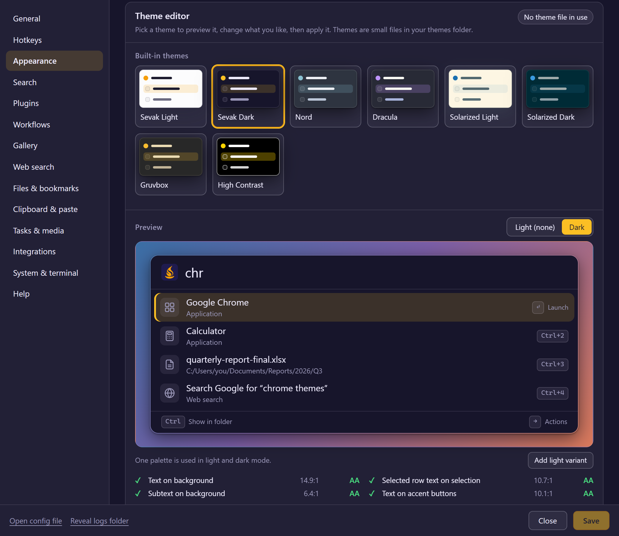
A theme is a small TOML file in the themes folder of your config folder (Settings → Appearance → Open themes folder). Settings → Appearance → Theme editor creates and edits them without touching the file:
- Eight themes ship with Sevak: Sevak Light, Sevak Dark, Nord, Dracula, Solarized Light, Solarized Dark, Gruvbox and High Contrast. Click one to preview it. Changing anything in a built-in makes a copy, because the built-in names stay as shipped.
- The preview is the launcher's own result row with sample rows, and updates as you edit. Light / Dark switches between a theme's two variants.
- Each color has a picker, a text field (
#rrggbb,#rrggbbaa,rgb()orrgba()) and an opacity slider. Sliders set the font size, corner radius, background opacity, row height, search field size, icon size and window width; Default takes a size back out of the theme. The font is a free-text list; the Installed fonts button fills the suggestions from the system when the window allows it. - Contrast shows the WCAG contrast ratio of the text on the background, of the selected row's text on the selection, of the subtext on the background and of the text on accent buttons. A pair under 4.5:1 (level AA) is flagged. It is a warning, not a block; every built-in theme passes all four.
- Undo, Redo and Reset step through your edits.
- Save as… writes
themes/<name>.toml. Apply saves it if needed and setstheme_file; press Save in Settings to keep that choice. Import… and Export… copy a theme file from and to anywhere on disk (an imported file is validated and rewritten in canonical form).
A theme file:
name = "Nord"
author = "Sevak"
description = "Arctic dark colors."

[font]
family = "Fira Sans, sans-serif"   # optional; empty is the system font
size = 15                          # 12-22

[layout]
radius = 14          # 0-32
opacity = 100        # 30-100
row_height = 48      # 32-96, px
search_size = 22     # 14-40, px, the text you type
icon_size = 32       # 16-64, px
window_width = 720   # 400-1600, px

[dark]               # and/or [light]
background = "#2e3440"
text = "#eceff4"
subtext = "#bcc7d8"
border = "rgba(236, 239, 244, 0.12)"
accent = "#88c0d0"
accent_strong = "#709dab"
on_accent = "#2e3440"
selection = "rgba(136, 192, 208, 0.2)"
# selection_text = "#eceff4"   # optional: the selected row's title; default: text
tile = "rgba(236, 239, 244, 0.08)"
kbd_background = "rgba(236, 239, 244, 0.08)"
kbd_border = "rgba(236, 239, 244, 0.16)"
shadow = "0 8px 28px rgba(0, 0, 0, 0.55), 0 1px 3px rgba(0, 0, 0, 0.4)"
surface = "rgba(236, 239, 244, 0.05)"
input_background = "rgba(236, 239, 244, 0.06)"
input_border = "rgba(236, 239, 244, 0.24)"
switch_off = "rgba(236, 239, 244, 0.28)"
warn = "#ebcb8b"
error = "#e5848d"
ok = "#a3be8c"
| Key | CSS variable | Used for |
|---|---|---|
background |
--bg |
Search bar and Settings background |
text |
--fg |
Text |
subtext |
--muted |
Subtitles, hints, placeholder |
border |
--border |
Hairlines |
accent, accent_strong, on_accent |
--accent, --accent-strong, --on-accent |
Caret, buttons, hover shade, text on accent |
selection |
--selected |
Background of the selected row |
selection_text |
--selected-fg |
Title of the selected row (default: text) |
tile, kbd_background, kbd_border |
--tile, --kbd-bg, --kbd-border |
Icon tiles and key caps |
shadow |
--shadow |
The bar's drop shadow |
surface, input_background, input_border, switch_off |
--surface, --input-bg, --input-border, --switch-off |
Settings window |
warn, error, ok |
--warn, --error, --ok |
Notices |
How a theme file is read:
- Every value is checked. A value that is not valid (a color that does not parse, a number out of range, a font name with odd characters, a shadow that is not a plain
box-shadowlist, an unknown key) is ignored with a warning shown under Settings → Appearance, and the rest of the file still applies. Only a file that is not TOML at all is refused. The file must be UTF-8 and at most 64 KiB, and its path follows the same rules ascustom_css. - One palette or two. A theme with only
[dark]or only[light]uses it in every mode (thethemesetting does not switch it). With both, the light one is used in light mode and the dark one in dark mode. Colors a palette leaves out keep the Sevak Light or Sevak Dark value of that mode. - Your settings still win.
font_size,font_family,opacityandradiusfrom the[appearance]table override the theme's values when they differ from their default (15, empty, 100, 14), and a non-emptyaccentreplaces the theme's accent and the colors derived from it. The theme'swindow_widthis used while[window] widthis the default 720. custom_csscomes last, so it can still override anything.
Theme gallery
The gallery is a list of community themes kept in Sevak's repository (gallery/themes.json, with the files in gallery/themes/). It is opt-in:
- Nothing is requested until you click Browse online themes in the theme editor. That one click makes a single
GETofgallery/themes.jsonfrom Sevak's repository at the tag of your Sevak version (https://raw.githubusercontent.com/ninad-k/Sevak/v<version>/gallery/themes.json; no cookies, no query, no identifying headers beyond aSevak/<version> (gallery)user agent; 20-second timeout; 256 KiB limit), through the same download code as the workflow gallery. The list is only listed, not installed. If your build has no published release (a local or pre-release build), Sevak reads the latest release's list instead and says so above the list. - Files are requested only from Sevak's own repository, also when a request is redirected; see Gallery trust.
- Install downloads that theme's file (https only, 64 KiB limit) and saves it to your themes folder only if its SHA-256 matches the
sha256in the list. A mismatch, a file that is not a valid theme, or a download that is too large is refused and nothing is written. The saved file is the validated theme in canonical form. - A theme of the same name is never replaced silently. If one is already in your themes folder, the install is refused and says so; Reinstall on an installed theme replaces exactly that theme.
- Nothing is sent about you, and nothing is downloaded or updated in the background. Without a network you can still use the built-in themes and Import….
The gallery has the eight built-in themes and eleven more, each reaching WCAG AA for body text:
| Theme | Mode | Palette |
|---|---|---|
| Tokyo Night | dark | Tokyo Night (MIT) |
| Catppuccin Mocha | dark | Catppuccin (MIT) |
| Catppuccin Latte | light | Catppuccin (MIT) |
| Rosé Pine | dark | Rosé Pine (MIT) |
| One Dark | dark | Atom's One Dark (MIT) |
| Everforest Dark | dark | Everforest (MIT) |
| Ayu Mirage | dark | Ayu (MIT) |
| Nightfox | dark | Nightfox (MIT) |
| GitHub Light | light | GitHub Primer (MIT) |
| GitHub Dark | dark | GitHub Primer (MIT) |
| Sevak Amber Glass | dark | original; slightly see-through (88% opacity), made for the frosted-glass blur setting |
Colors taken from a third-party palette are credited, with their licences, in gallery/README.md and in the first comment of each theme file; a few notice or subtext colors are adjusted so text stays readable.
To share a theme, put the file in gallery/themes/, add an entry to gallery/themes.json (its url is the file's path below the repository root, such as gallery/themes/My-Theme.toml, never a web address; node scripts/gallery-check.mjs --update fills in the hash) and open a pull request; see gallery/README.md.
Custom stylesheet
custom_css names a file inside the config folder, for example theme.css next to config.toml (or themes/dark-purple.css). It is a plain CSS stylesheet loaded after Sevak's built-in theme and appearance settings, so it overrides all of them.
Rules for custom stylesheets
- The path must be relative and stay inside the config folder: no absolute paths, no
.., and a symlink pointing outside is refused - The file must be UTF-8 and at most 64 KiB; otherwise it is ignored with a warning
- It is read again whenever the config is reloaded (tray menu) or saved (Settings)
- It cannot load anything from the network: Sevak's content security policy blocks remote stylesheets, fonts and images. Use fonts installed on your system and
data:URLs - If you keep the config folder in a synced folder, your theme travels with it
Example theme
/* theme.css: purple dark theme */
:root {
  --bg: #1b1030;
  --fg: #f1e9ff;
  --muted: #a99bc8;
  --accent: #a78bfa;
  --accent-strong: #8b5cf6;
  --on-accent: #1b1030;
  --selected: rgba(167, 139, 250, 0.2);
}
Scoping to light or dark mode
The built-in light and dark values are applied with the same specificity as a plain :root rule, and your file comes later, so :root { ... } overrides everything.
To change a variable only in one mode:
:root[data-theme="dark"] { --bg: #0a0a0a; }        /* when theme = "dark" */

:root[data-theme="light"] { --bg: #fafafa; }       /* when theme = "light" */

@media (prefers-color-scheme: dark) {              /* when theme = "system" and OS is dark */
  :root:not([data-theme]) { --bg: #0a0a0a; }
}

@media (prefers-color-scheme: light) {             /* when theme = "system" and OS is light */
  :root:not([data-theme]) { --bg: #fafafa; }
}
CSS variables
Set by the light and dark themes (ui/src/app.css):
Appearance
| Variable | Used for |
|---|---|
--bg |
Search bar and Settings window background |
--fg |
Main text color |
--muted |
Secondary text: subtitles, hints, placeholder |
--border |
Hairlines between sections and form fields |
--accent |
Caret, buttons, switches, slider thumbs, focus rings |
--accent-strong |
Hover and focus states of accented elements |
--on-accent |
Text and icons on an accent background |
--selected |
Background of the selected result row |
--tile |
Background behind result icons |
--shadow |
The search bar's drop shadow (a box-shadow value) |
UI elements
| Variable | Used for |
|---|---|
--kbd-bg, --kbd-border |
Key-cap hints (Ctrl+K, Enter labels) |
--warn, --error, --ok |
Notice, error and success message colors |
--surface |
Panels and sections in the Settings window |
--input-bg, --input-border |
Text fields and select boxes in Settings |
--switch-off |
Toggle track when off; slider track |
--selected-fg |
Title of the selected result; when unset it follows --fg |
Computed from settings
These are set automatically from appearance settings (override them in your stylesheet if you prefer):
| Variable | Source | Default |
|---|---|---|
--font-family |
font_family setting |
system font |
--font-size |
font_size setting |
15px |
--font-scale |
font_size / 15 |
multiplies other text sizes and row height |
--radius |
radius setting |
14px |
--card-opacity |
opacity / 100 |
1 |
--row-h |
a theme's row_height |
max(48px, 48px * scale): height of a result row |
--search-size |
a theme's search_size |
22px * scale: size of the text you type; the bar's height follows it |
--icon-size |
a theme's icon_size |
32px: size of the result icons |
Theme examples
Share your theme through the theme gallery! Examples could include:
- High-contrast themes for accessibility
- Seasonal themes (holiday colors, etc.)
- Themed to match your wallpaper
- Minimal or dark themes
The class names inside Sevak's UI may change between versions, so override only CSS variables and avoid selectors like .result or .row. A theme file is the more durable way to share colors and sizes.